
[Flutter] 플러터 레이아웃 튜토리얼 진행
- Study/FrontEnd
- 2021. 5. 23. 17:05
링크 - Building layouts - Flutter
레이아웃 뽀개기
지난 포스팅에서 했던 스타트업 이름 지어주는 튜토리얼을 지나서, 이번엔 레이아웃을 연습해보는 튜토리얼을 진행했다.
공식 홈페이지에는 튜토리얼 전에 이론에 대해서도 잠깐 설명해주는데, 그냥 일반적인 이론들이라서 패스했다 ㅋㅋㅋ
아마 안드로이드나 아이폰을 개발해본 사람이라면 쉽게 이해할 수 있을 텐데, 플러터도 행과 열로 레이아웃을 짜는 구조라서 안드로이드의 리니어 레이아웃과 비슷하다. 따라서 Column과 Row를 잘 조합해서 바둑판식으로 레이아웃을 조절할 수 있다. 이건 모바일뿐만 아니라 웹도 비슷하니까, 프론트를 해보신 분들은 저보다 더 잘 알듯..
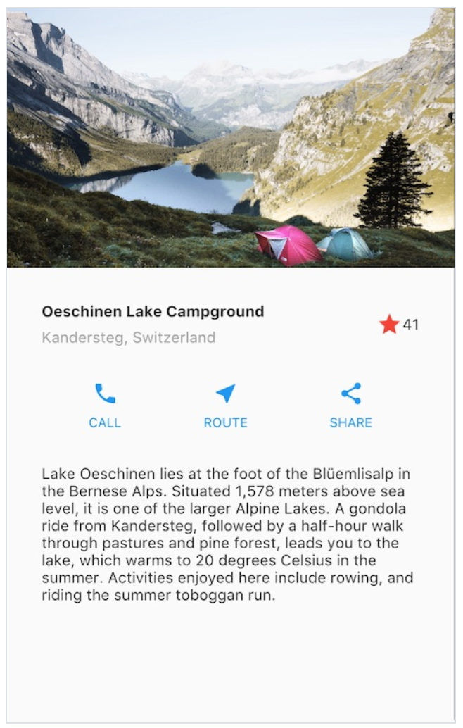
일단 위에 올린 사진대로 앱을 만드는것이 목표다.

레이아웃을 보면 크게 이미지, 텍스트랑 별표시가 있는 그룹, 버튼 그룹, 텍스트 박스 그룹으로 나눌 수 있다. 이 4개를 Column으로 나열하면 바로 된다.
그럼 먼저 저 지역명이랑 별표있는거 만들어보자
TitleSection 만들기
아마 지역명이랑 설명, 즐겨찾기 별표가 있는걸 TitleSection이라고 부르나보다. 일단 기본 앱을 만들어서 HelloWorld를 띄우고 그 아래 Widget titleSection을 추가하자
import 'package:flutter/material.dart';

void main() {
  runApp(MyApp());
}

class MyApp extends StatelessWidget {
  // This widget is the root of your application.
  @override
  Widget build(BuildContext context) {
    return MaterialApp(
      title: 'Flutter Demo',
      theme: ThemeData(
        primarySwatch: Colors.blue,
      ),
      home: titleSection
    );
  }

  Widget titleSection = Container(
  );
}
여기서 titleSection이라는걸 Container로 만든다. Container가 뭔지 찾아보면 공식문서에는 이렇게 나온다.
Container is a widget class that allows you to customize its child widget. Use a Container when you want to add padding, margins, borders, or background color, to name some of its capabilities.
뭔가 html에 div같은 박스 느낌.
  Widget titleSection = Container(
    padding: const EdgeInsets.all(32),
    child: Row(
      children:[
        Expanded(
          child: Column(
            crossAxisAlignment: CrossAxisAlignment.start,
            children: [
              Container(
                padding: const EdgeInsets.only(bottom: 8),
                child: Text(
                  'Oeschinen Lake Campgroud',
                  style: TextStyle(
                    fontWeight: FontWeight.bold,
                  ),
                ),
              ),
              Text(
                'Kandersteg, Switzerland',
                style: TextStyle(
                  color: Colors.grey[500],
                ),
              )
            ],
          ),
        ),
        Icon(
          Icons.star,
          color: Colors.red[500],
        ),
        Text('41'),
      ]
    ),
  );
위와 같이 titleSection을 채우고 MyApp 쪽에 home:Scaffold로 바꿔주고 appBar를 추가해주면 어느 정도 그럴듯하게 첫 번째 위젯이 나오게 된다.
 @override
  Widget build(BuildContext context) {
    return MaterialApp(
      title: 'Flutter Demo',
      theme: ThemeData(
        primarySwatch: Colors.blue,
      ),
      home: Scaffold(
        appBar: AppBar(
          title: Text('Flutter layout demo'),
        ),
        body: Column(
          children: [
            titleSection,
          ],
        ),
      )
    );
  }
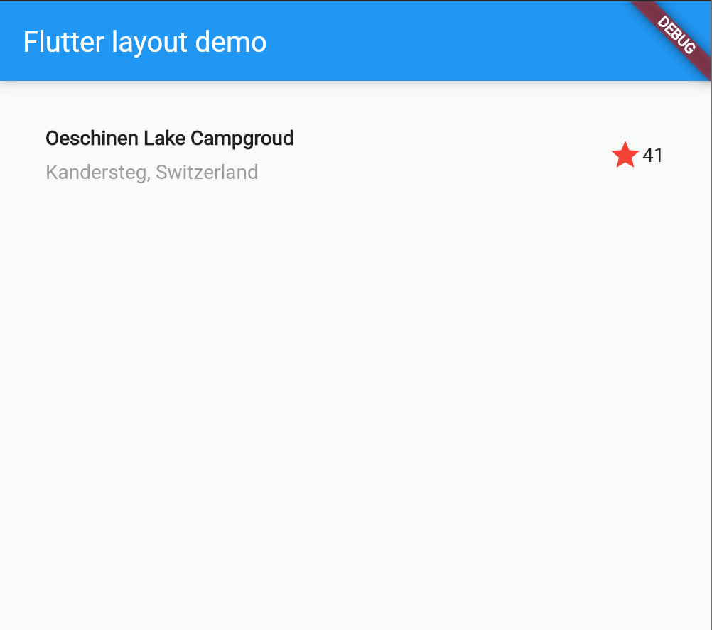
사실 보이는 layout은 훨씬 더 간단해 보이는데 titleSection 위젯을 보면 상당히 복잡해 보인다. 그냥 넘어가는 게 아니라 Row나 Column값을 바꿔보거나 속성 값을 바꿔보면서 어느 정도 익숙해지는 게 좋을 것 같다. Row와 Column이 번갈아가며 등장하기 때문에 순서를 바꿔보면 layout에 대한 감을 잡을 수 있다.
ButtonSection, TextSection 만들기
버튼은 자세히 보면 Row layout이 최 상단에 있고 그 안에 Column layout이 3개가 들어있는 구조이다. Column은 아이콘과 텍스트가 들어있다. 먼저 안에 있는 Column을 만드는 함수를 만든다. 자바로 따지면 Column 객체를 만드는 것이다.
Column _buildButtonColumn(Color color, IconData icon, String label){
return Column(
mainAxisSize: MainAxisSize.min,
mainAxisAlignment: MainAxisAlignment.center,
children: [
Icon(icon, color: color),
Container(
margin: const EdgeInsets.only(top:8),
child: Text(
label,
style: TextStyle(
fontSize: 12,
fontWeight: FontWeight.w400,
color: color,
),
),
),
],
);
}
DART라는 언어가 C언어와 비슷하다고 하는데, 뭔가 배우면 배울수록 C 같다 라는 생각이 든다. 세미콜론 찍는 것 하며, 함수 선언하는 것까지 C와 너무 흡사하다. 위 _buildButtonColumn은 color, icon, label 3가지를 넣어서 Column을 뱉어내는 함수이다. 이제 이 함수를 사용해서 3개의 Column을 호출하는 Row 위젯을 만들면 된다.
    Color color = Theme.of(context).primaryColor;

    Widget buttonSection = Container(

        child:
        Row(
          mainAxisAlignment: MainAxisAlignment.spaceEvenly,
          children: [
            _buildButtonColumn(color, Icons.call, 'CALL'),
            _buildButtonColumn(color, Icons.near_me, 'ROUTE'),
            _buildButtonColumn(color, Icons.share, 'SHARE'),
          ],
        )
    );
코딩하면서 알았는데 이 Widget으로 선언하는 것들은 MyApp에 build 안에 있어야 한다. 사실 build 밖에서 선언해도 문제없었는데. 이번에 context를 불러오는 코드를 추가하니까 밖에서는 안된다 ㅋㅋㅋ
이거 react처럼 간단하게 선언하는 함수들 Widget buttonSection = Container(blar blar) 요런 것들은 메소드 안에 있어야 하는 것 같다. build 소스를 보면 아래와 같다.
@override
  Widget build(BuildContext context) {

    Widget titleSection = Container(
      padding: const EdgeInsets.all(32),
      child: Row(
          children:[
            Expanded(
              child: Column(
                crossAxisAlignment: CrossAxisAlignment.start,
                children: [
                  Container(
                    padding: const EdgeInsets.only(bottom: 8),
                    child: Text(
                      'Oeschinen Lake Campgroud',
                      style: TextStyle(
                        fontWeight: FontWeight.bold,
                      ),
                    ),
                  ),
                  Text(
                    'Kandersteg, Switzerland',
                    style: TextStyle(
                      color: Colors.grey[500],
                    ),
                  )
                ],
              ),
            ),
            Icon(
              Icons.star,
              color: Colors.red[500],
            ),
            Text('41'),
          ]
      ),
    );

    Color color = Theme.of(context).primaryColor;

    Widget buttonSection = Container(

        child:
        Row(
          mainAxisAlignment: MainAxisAlignment.spaceEvenly,
          children: [
            _buildButtonColumn(color, Icons.call, 'CALL'),
            _buildButtonColumn(color, Icons.near_me, 'ROUTE'),
            _buildButtonColumn(color, Icons.share, 'SHARE'),
          ],
        )
    );

    return MaterialApp(
      title: 'Flutter Demo',
      theme: ThemeData(
        primarySwatch: Colors.blue,
      ),
      home: Scaffold(
        appBar: AppBar(
          title: Text('Flutter layout demo'),
        ),
        body: Column(
          children: [
            titleSection,
            buttonSection
          ],
        ),
      )
    );
  }
TextSection은 더 간단하다. 그냥 Widget을 만들고 텍스트만 리턴하면 되니까
    Widget textSection = Container(
      padding: const EdgeInsets.all(32),
      child: Text(
        'Lake Oeschinen lies at the foot of the Blüemlisalp in the Bernese '
        'Alps. Situated 1,578 meters above sea level, it is one of the '
        'larger Alpine Lakes. A gondola ride from Kandersteg, followed by a '
        'half-hour walk through pastures and pine forest, leads you to the '
        'lake, which warms to 20 degrees Celsius in the summer. Activities '
        'enjoyed here include rowing, and riding the summer toboggan run.',
      softWrap: true,
      ),
    );
ImageSection 만들기
lake.jpg (1000×760) (raw.githubusercontent.com)
일단 이미지를 받은 다음에 pubspec.yaml에 가서 이미지를 추가하자. flutter에서는 assets을 pubspec.yaml에서 추가하는 것 같다. 실제로 pubspec.yaml에 가면 아래와 같은 주석을 발견할 수 있다.
  # To add assets to your application, add an assets section, like this:
  # assets:
  #   - images/a_dot_burr.jpeg
  #   - images/a_dot_ham.jpeg
flutter: 아래 user-material-design:true 아래에 이미지를 추가해준다.
flutter:

  # The following line ensures that the Material Icons font is
  # included with your application, so that you can use the icons in
  # the material Icons class.
  uses-material-design: true
  assets:
    - images/lake.jpg
  # To add assets to your application, add an assets section, like this:
  # assets:
  #   - images/a_dot_burr.jpeg
  #   - images/a_dot_ham.jpeg
그리고 images폴더는 프로젝트 root폴더에 생성해준다.
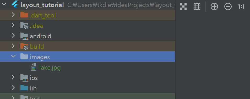
Image Section은 따로 함수로 만들지 않고 mATERIALaPP에 직접 추가해줍니다.
return MaterialApp(
      title: 'Flutter Demo',
      theme: ThemeData(
        primarySwatch: Colors.blue,
      ),
      home: Scaffold(
        appBar: AppBar(
          title: Text('Flutter layout demo'),
        ),
        body: Column(
          children: [
            Image.asset(
              'images/lake.jpg',
              width: 600,
              height: 240,
              fit: BoxFit.cover,
            ),
            titleSection,
            buttonSection,
            textSection
          ],
        ),
      )
    );
  }
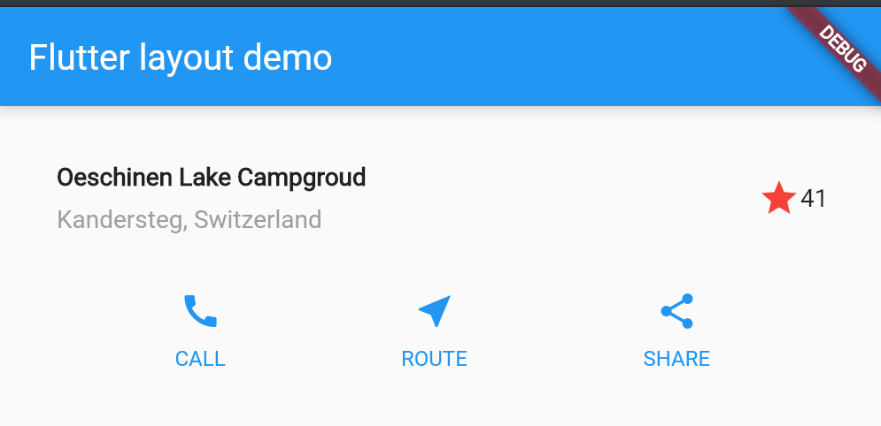
Image.asset을 통해 Children 리스트에 이미지를 추가합니다. 그리고 실행하면...
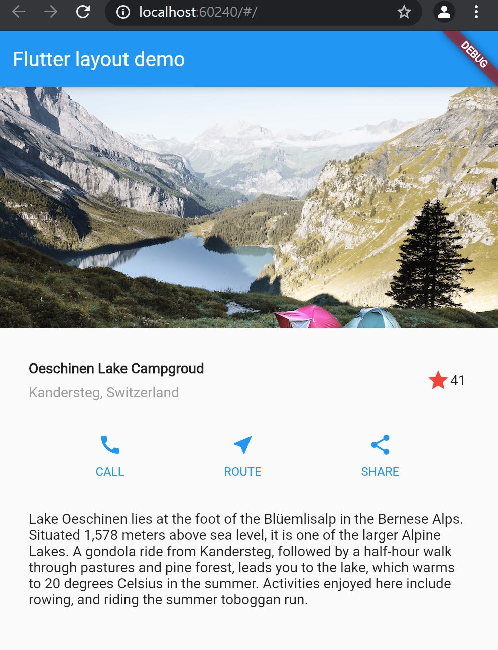
간단한 Layout 코드만으로 괜찮은 디자인이 나왔습니다. :)
마지막으로 MaterialApp에서 body 부분을 Column으로 했었는데, List로 바꿔줍니다. Column과 List의 차이점은 Column의 경우 고정이라서 작은 디바이스에서 스크롤이 안되고, Lisk로 할 경우 작은 디바이스에서 화면이 넘 칠경 우 자동으로 스크롤이 생겨서 전체 콘텐츠를 볼 수 있습니다.
'Study > FrontEnd' 카테고리의 다른 글
| [Flutter] #2 stateful widget (0) | 2021.07.22 |
|---|---|
| [Flutter] #1 flutter layout (0) | 2021.07.18 |
| [Flutter] 튜토리얼 앱 만들기 (0) | 2021.05.03 |
| react - django, cors 문제. django-cors-headers를 깔아도 문제가 발생할 때 (0) | 2021.04.21 |
| [Flutter] 설치하기 (2) | 2021.04.02 |